Branding, UI Design
Project Overview
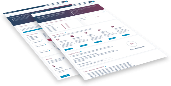
The Food and Drug Administration uses SaMD (software as a medical device) to provide informational and diagnostic information to users, clinicians, and SaMD vendors. This application supports the FDA in its mission-critical role of vetting and approving software utilized for medical purposes to protect US healthcare consumers.
- Client: U.S Food and Drug Administration
- Project Duration: 3 months
- Platform: Desktop
- Tools: Sketch, Sketch Measure
Identifying the Problem
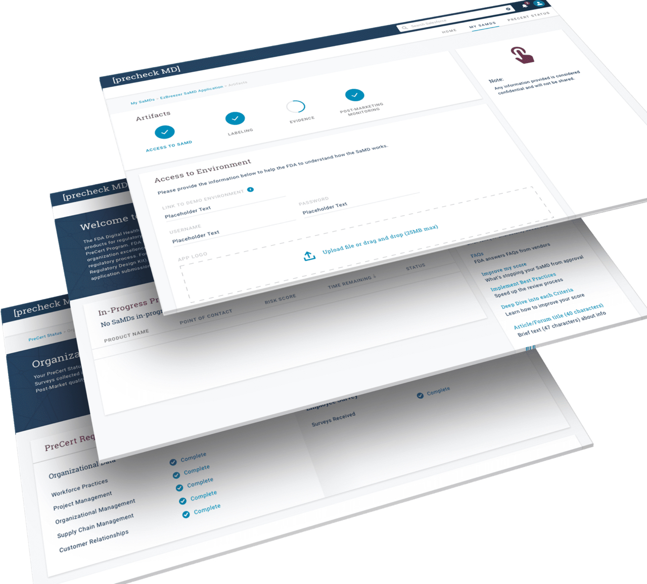
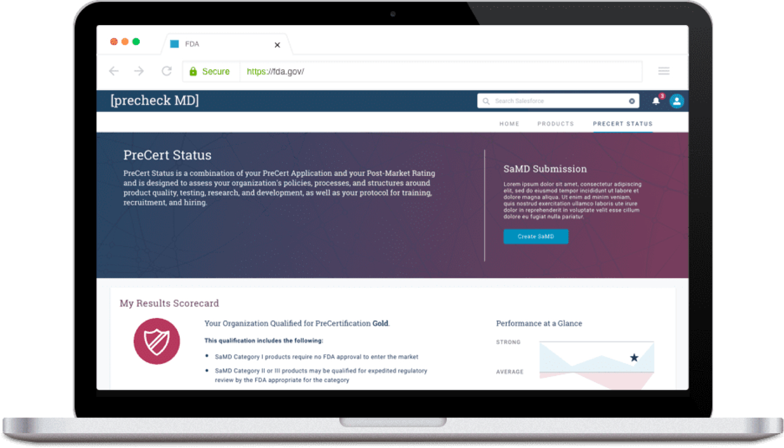
FDA SaMD needed a web-based system built in Salesforce allowing for a simple registration process as well as access to tier-level information for its users. Creation of a logo and branding guideline were also delivered.
My Role
Working alongside an art director, we held a branding workshop with the client and account team to define the new style for FDA SaMD that is a refreshing expansion on the FDA brand.
Challenges Along the Way
- Quick turnaround time with visual comp delivery
- Unfamiliarity with Salesforce customization
- Working with the account team vs. working with the client directly
- Complex content generation took an unexpected amount of time
- Client suggested vital changes that were out of scope during development
Process
The key to successfully creating this project included gaining a solid familiarity with the Salesforce Lightning Design System. With many components already at our disposal, we were able to identify assets that were able to be developed with custom CSS.
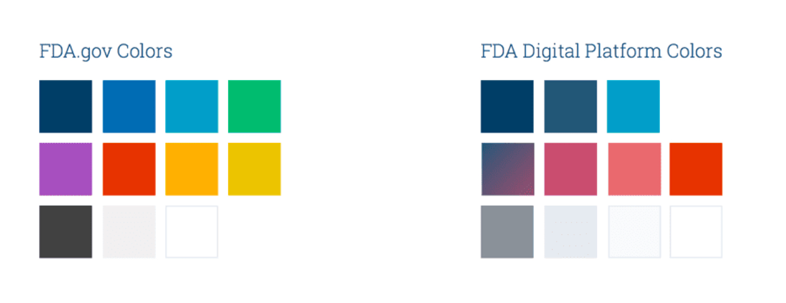
The FDA granted us creative freedom to branch off of their standard brand fonts and colors to formulate a new identity for this specific application. With such an open ended direction, we collaborated directly with the account team and client to hold a branding workshop to create a brand that best represents the product.
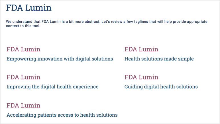
What’s in a name
Lumin connects back to the Latin word for light (lumen), which can be interpreted in many ways – in the literal sense, like the sun, or more abstractly, as in simplifying or easing a burden. Light also has an emotional appeal as it relates to happiness, health and wellness. Specifically, Lumin (vs. lumen) signifies “luminescence” – bright light that is produced by a scientific process, providing a way forward. This hints toward the tool’s ability to streamline the FDA’s digital review processes, “lighten the lift”, and create impactful, positive health solutions for the future.
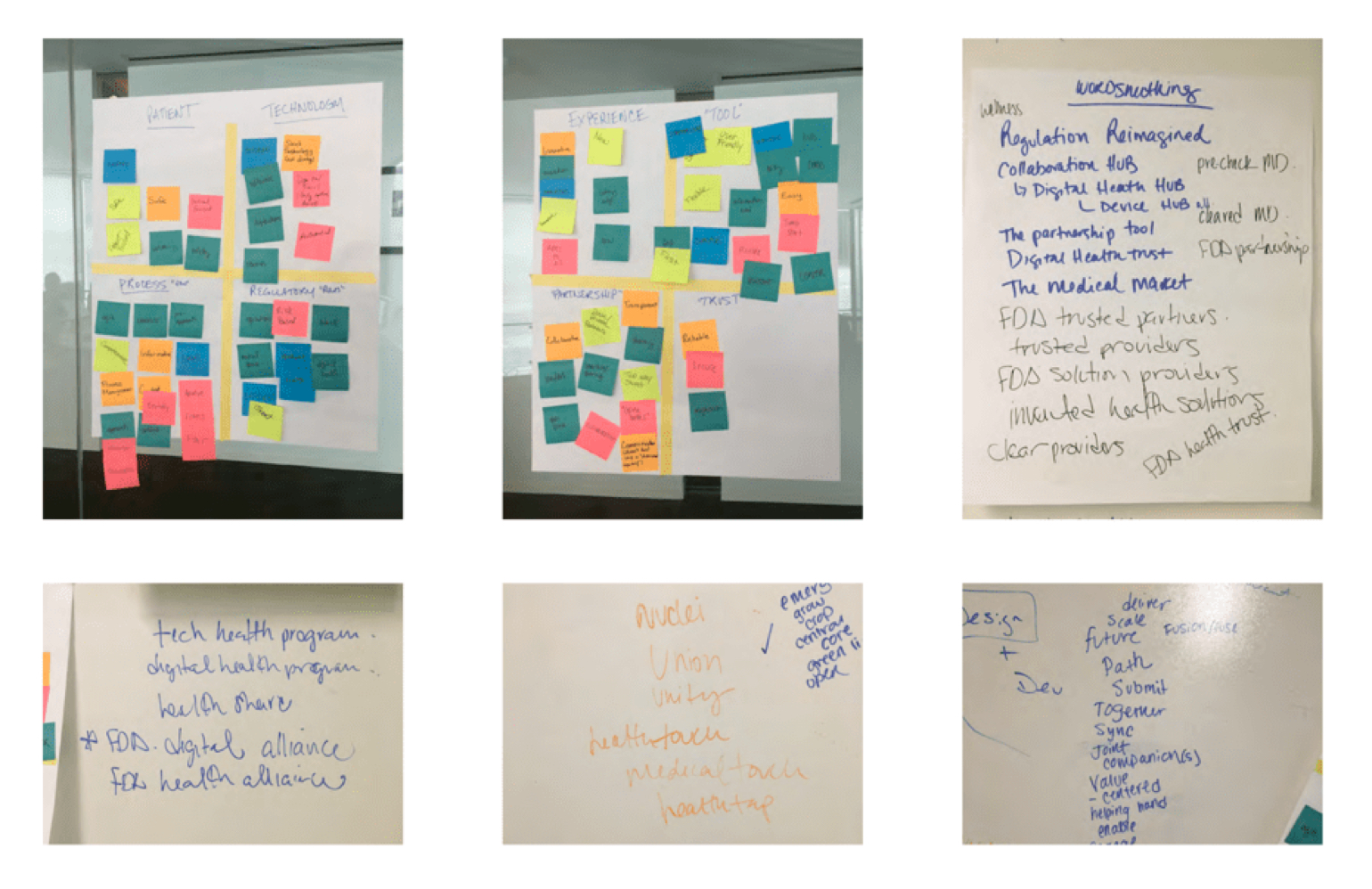
Branding Workshop
To pinpoint the right brand for the FDA SaMD project we held a branding workshop. Each member of the account team, visual team, UX, and project management wrote words and phrases that correlated to anything related to the vision of what the platform will be. After categorizing each word into similar patterns, we discovered common themes such as patient, technology, experience, tool, partnership, experience, and trust.
Visual Styling
The proposed color palette overlaps with main FDA colors, but provides for a unique look and feel that appeals to the users of the platform. FDA Digital Platform palette compliments the “umbrella” brand of the FDA through the use of blues and grey. We have toned down the use of red as this man be misleading to a user’s attention and often signifies “danger” or “error”. The purple has shifted to hibiscus and poppy to allow for improved 508 contrast for the use of type and iconography.
